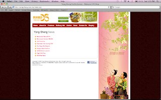
Client Website - Yong Sheng

- navigation bar got roll over effect, clear and easy to find
- grid system, easier for user to read
- content very clear
Bad
- over all color combination not very nice enough
- weird photo for home page
- the hamper place on top, not very nice

can be more interesting like add in some more picture and colors

Good
- the photos of the product very attractive
- list out the price of the product
Bad
navigation bar also did not shown

Outlets and Contact Us can be combine together.
News a bit boring.
can show some content with the title, user can read a bit
and decide which news they want to read.
No comments:
Post a Comment