Friday, September 24, 2010

Thursday, September 16, 2010

Sunday, September 12, 2010
Web Design 2 - Redesign Commercial Website

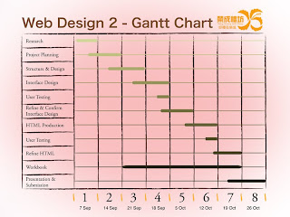
Gantt Chart

Site Map
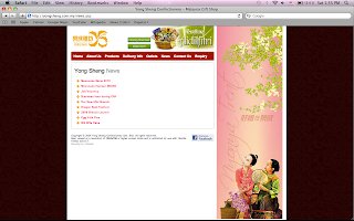
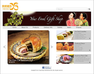
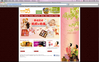
Client Website - Yong Sheng


Good
- navigation bar got roll over effect, clear and easy to find
- grid system, easier for user to read
- content very clear

Bad
- over all color combination not very nice enough
- weird photo for home page
- the hamper place on top, not very nice


can be more interesting like add in some more picture and colors


GoodBold
- the photos of the product very attractive
- list out the price of the product

Bad
- do not have a title for every page, user might confuse where they are,
navigation bar also did not shown


Outlets and Contact Us can be combine together.


News a bit boring.
can show some content with the title, user can read a bit
and decide which news they want to read.

Competitor's website

no.1

no.2

no.3

no.4

no.5

- not consistent
- nice design for no.2 and no.3, if the background color are same will be better
- no.3 and no.4 color very outstanding, very attractive
- contact us can be in a web page, pop up a box not very nice


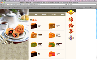
Kamluntai
mfg.asiaep.com/my_com/kamluntai/chinese/kamluntai.htm


- very formal style, quality assurance
- reliable, trustworthy
- nice layout and navigation bar
- user friendly =)


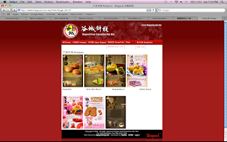
Bisgood
www.bisgood.com.my/html/?page_id=2


- looks fresh and new
- reliable, trustworthy
- tidy web layout
- user friendly =)
- attractive web pages


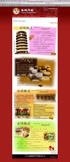
Bakers Cottage


- color combination still okay
- not fresh and new enough
- overall looks old design
- navigation bar too long, hierarchy not obvious enough, will confuse
- not user friendly


Dai Thong

- very simple design but nice yet
- overall clean and formal
- reliable
- user friendly


Inspirative Commercial Website

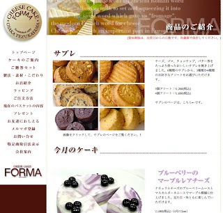
www.forma-cake.jp


- clear navigation bar
- interesting top bar design
- target audience : young people


www.donut.co.jp


- color mood very warm and comfortable
- navigation bar better align left
- page layout simple but nice, clean and clear
- target audience : young people


www.haagen-dazs.com


- the font of the navigation bar suitable enough
- mouse over effect
- background color light, the product more outstanding
- overall looks elegant


www.lollipopbakery.cn


- play with spacing and transparency
- looks high class and expensive
- font size quite suitable, small but clear


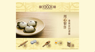
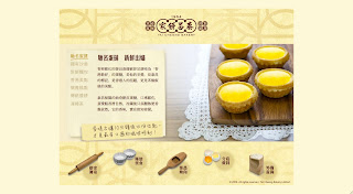
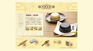
www.taicheongbakery.com/tc


- beige/ light yellow looks delicious
- brand new
- interesting navigation bar with graphic
- playful and serious
- photos very attractive
- content box quite nice
- more focus on 18 - 50 years old


www.koikei.com


- the combination of reminiscence and modern
- it looks elegant
- product very outstanding because of the background color


www.sophisca.com.tw


- pinky pinky very sweet
- looks commercial also
- very attractive, especially for girls


www.choi-heong-yuen.com/current/sc/main.php


- navigation bar very tidy, feel good
- red tone for the background, white color for the font,
navigation bar very obvious and easy to read


HTML Tutorial


http://www.htmlcodetutorial.com/

They provide the most helpful and complete guide to creating web pages anywhere.


http://www.w3schools.com/html/

This tutorial teaches you everything about HTML.
This HTML tutorial contains more than 100 HTML examples.
With their HTML editor, you can edit the HTML,
and click on a button to view the result.

http://www.htmlprimer.com/

HTML for beginners, Advanced HTML

CSS for beginners, Advanced CSS


http://www.2createawebsite.com/build/html.html

You will also get access to video tutorials that are perfect for any newbie getting started with their first website


http://www.html.net/tutorials/html/

15 lessons to create a website.


http://www.echoecho.com/html.htm

You can use this tutorial either as a complete introduction or as an A-Z reference to HTML.The pages are packed with : Easy to understand explanations, massive examples, tips, smart workarounds and useful quick references.


Design Tutorial

http://www.entheosweb.com/dreamweaver/default.asp

Here you will learn some cool Dreamweaver tips, Dreamweaver Behaviors, CSS in Dreamweaver, Using Templates in Dreamweaver and more!


http://dzineblog.com/2008/07/best-photoshop-layout-design-tutorials.html

27 best Photoshop Web Layout Design Tutorials to Design Decent Web Layouts


http://www.hongkiat.com/blog/40-greatest-web-interface-design-tutorials-photoshop-tutorial/

40 Greatest Web Interface Design Photoshop Tutorials


http://webdesignledger.com/tutorials/20-high-quality-photoshop-web-design-tutorials

20 High Quality Photoshop Web Design Tutorials


http://sixrevisions.com/photoshop/25-photoshop-tutorials-for-web-designers/

In this collection, you’ll find 25 excellent Photoshop tutorials geared towards web designers. You’ll find a variety of tutorials that include creating full web page templates, navigation menus, headers, and content boxes


User-Friendly Navigation Menus

http://www.smashingmagazine.com/2009/02/04/50-beautiful-and-user-friendly-navigation-menus/

50 excellent navigation menus — they feature CSS-based design solutions, CSS+JavaScript-based menus and Flash-designs


http://www.designinginteractive.com/design/50-tips-to-a-user-friendly-website/

50 Tips To A User Friendly Website